Key U.S. Employment Indicators
Key U.S. Employment Indicators
US Labor Market is Robust. On Friday the BLS reported that total non-farm payroll employment grew by 255,000 jobs for July, solidly better than expected. The markets broadly rallied to new all-time highs, and the VIX Volatility (Fear) Index fell to near all-time lows. Despite this crazy presidential election cycle, market volatility is at an all-time low, so kudos to the Fed for being able to pull this off thus far! But, also be wary for any cracks in the economy, which for us focus on Fed Assets and Government Debt.
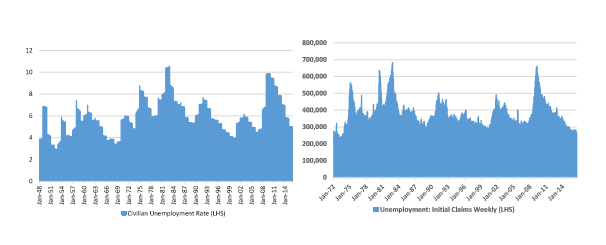
Figure 1. Unemployment Rates and Weekly Claims are Falling, Reflecting Strength in Job Market
Source: Fred.StLouisFed.Org
Strong Positive – U.S. Labor Market suggests the US economy is Generally Healthy Still; Initial Weekly Claims are Robust. Looking above, we see weekly jobless claims rose to peak levels consistent with other mega-recessions of the past in 2009-2010, but have now fallen all the way down to what are essentially modern-era lows, suggesting that firms are hiring and the economy is buzzing some. We take this data in context of all the other challenges and issues facing the global economy including governmental debt and others.
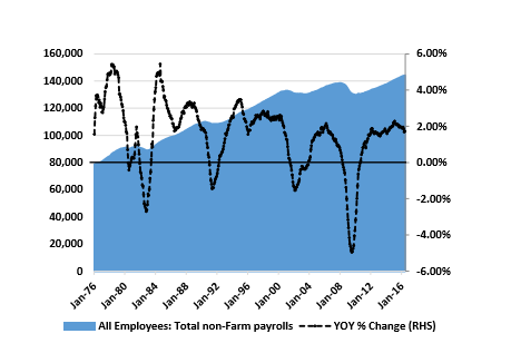
Figure 2. Total Non-Farm Payrolls are Robust and Still Rising; Reflects Strength in Job Market
Source: Fred.StLouisFed.Org
Strong Positive – Non-Farm Payroll metrics are strong; Still Growing Year-over-Year. Job gains have averaged nearly 200,000 per month over the past year, but openings still hover near an all-time high. Furthermore, we see no signs yet that growth in non-farm payrolls will turn negative, and we note that job growth on a year-over-year basis peaked in early 2006 and then spent 30 months falling before waves of selling set in during mid-2008 as the US entered the Great Recession. This would suggest we will see some job weakness as an indicator of more weakness to come (or as an Effect of other economic weakness).
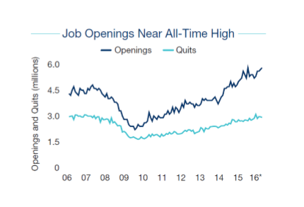
Figure 3. Job Openings and Quits are both Strong, Reflecting Strength in Job Market
Source: Marcus and Millichap
Strong Positive – Job Openings and Quits are Both Strong. Job gains have been robust over the past year. According to March & Millichap, the number of workers quitting jobs, presumably for higher pay, is also high. In fact, we see a high spread between Job Openings and Quits, indicating robust hiring activity, and suggesting a mis-match in the skills of US workers versus available job openings. Our economy would benefit from some broadbased Job retraining programs around the US.
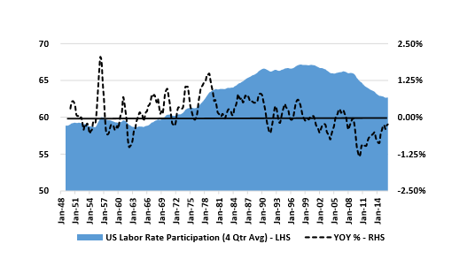
Figure 4. Labor Participation Rate Continues Its Steady March Lower
Source: Fred.StLouisFed.org
Modest Negative – Labor force participation rate still falling, partially driven by demographics. In the above graph we see that the US Labor Participation Rate is still falling, as it has been since roughly 1999. While some of this is driven by demographics – an aging number of Baby Boomers – we think other causes are driven by socio-economic issues, greater availability of different welfare programs, a mis-match between available jobs and skills, increasing use of robots to replace human workers, higher labor and related insurance/litigation costs, and more peoples’ desires to just not work. We think a stabilizing longterm US Labor Participation Rate would be a plus, and the data looks like it may begin leveling out soon (but the world of robots may preclude this).
Key Conclusions regarding Employment Data: Net, this data looks strong and it seems like the domestic economy is on stable footing for now. That said, a downturn could begin to occur at any time, driven by a variety of Global economic factors, excessive cheap money, or excessive government debt. In a Self Fulfilling Prophecy’ downturn scenario, employment reductions could be the effect of softness, not the cause of it. Thus, we need to keep looking at other indicators to maintain vigilance.
Key Economic and Realty Related Indicators
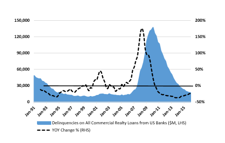
Figure 5. Delinquencies on Commercial Realty Loans Low & Falling; No Sign of Late Cycle Surge
Source: Fred.StLouisFed.org
Strong Positive – Commercial realty-backed Loan Delinquencies are still falling, and are approaching typical levels experienced from 1995-2006. Looking at the above graph, we see that Commercial Realty-backed loans are near all-time low levels. And when looking back at the last cycle we see that Commercial Realty-backed loan delinquencies began to rise as early as 2005, and rose throughout 2006-2008 before the Great Recession engaged fully. This suggests that Commercial Realty bank loans will not be the source of economic trouble anytime soon.
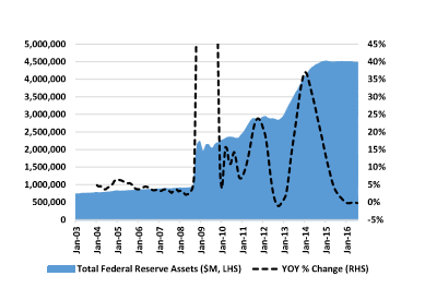
Figure 6. Fed Assets have Ballooned since 2008, a Major Risk Factor
Source: Fred.StLouisFed.org
Strong Negative – Fed Assets have Ballooned to $4.5 Trillion since 2008, a Major Risk Factor. Looking at the chart above, we see that Total Fed Assets rose from $725 Billion at the start of 2003 to $1.0B in September 2008, and then skyrocketed to $4.5 Trillion (yes with a T) by year-end 2014. A relative plus, Fed Assets have held steady since year-end 2014. Wow, this is a lot of assets on the Fed’s balance sheet that did not exist before, introducing considerable risks into the US financial system. As the Fed buys’ these assets from private sector financial and banking institutions, it pays for them with cash (that did not exist before), and these financial institutions can then turn around and directly lend this new found money to Borrowers. We do not yet know the impacts of these dramatic liquidity expanding actions, or if the Fed can or will ever reverse course and decrease its balance sheet assets, but this paradigm shift in how the Fed operates can only be viewed as eye-raising, and a long-term negative that meaningfully increases bubble risks and inflation risks, and lessens the Fed’s ability to fight future recessions using this tool. Big picture, we do see Cheap Money’ risks and Government Debt risks evident in the Fed balance sheet data and in a variety of other financial and interest rate metrics. We will tackle a Government Debt section here soon.
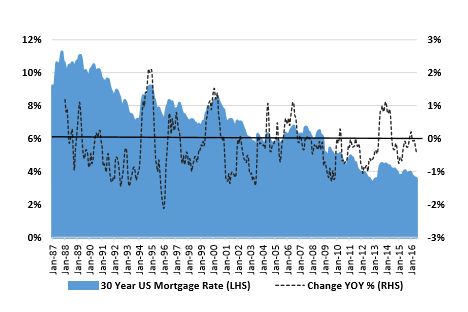
Figure 7. 30-Year Fixed Rate Mortgage Average in the United States
Source: Fred.StLouisFed.org
Mixed to Negative – 30-year US Mortgage Rates continue to move lower, juicing the housing market and increasing systemic risks to the US economic system. 30-year mortgage rates are now basically even with all time prior lows achieved in late 2012 and early 2013. Clearly, low 30-year Mortgage Rates are improving housing affordability for purchasers in both the residential and commercial markets, driving strength to the overall US realty market. Very low rates are definitely juicing’ the housing and commercial realty markets, and we think this is a risk. How low can rates go? With negative Central Bank deposit rates in Japan, it seems that US markets still have a little further to go until we are in that situation, though much of the declines in interest rates are now likely behind us. If mortgage rates were to suddenly rise, both the Residential and Commercial realty markets would take a hit, prices would soften, and wealth would disappear, leading to some level of economic weakness we hope the Fed will walk rates up slowly.
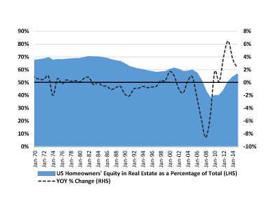
Figure 8. Owners’ Equity in Real Estate as a Percentage of Household Real Estate
Source: Fred.StLouisFed.org
Positive – US Homeowner’s Equity is Again Rising; Almost back to Normal Levels. This interesting graph shows US Homeowners’ home equity as a percentage of total home value, or how much of the average homeowner’s home value is equity versus debt. What we see is that Homeowners Equity fell from 70% in the mid-1980s to 60% by the mid-1990s as Americans took on more debt and as higher loan-to-value mortgages became available. Then, by 2005 Homeowners’ Equity started falling again as consumer credit standards loosened, and also due to declining home prices, and fell all the way down to 38% in 2009. Homeowner’s Equity has since recovered to 56% for 2015, almost reaching the low end of historically typical ranges. We expect that with strengthening home prices in 2016, more homeowners will have more equity in their homes again, and this figure should rise toward that 60% level seen in years past.
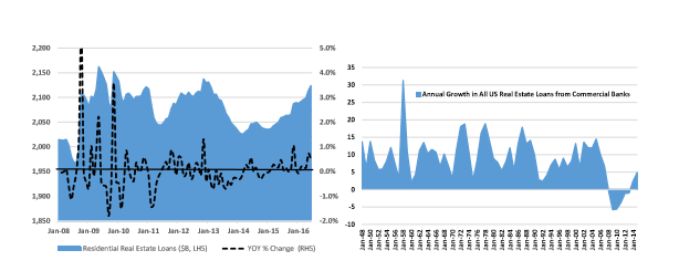
Figure 9. Residential Real Estate Loans Have Not Exploded Higher
Source: Fred.StLouisFed.org
Slight Positive – Total US Residential Loans Holding Steady Since 2009. Looking at Residential Real Estate loans in the US (above first chart), we see that total loans have held somewhat steady since the crash year of 2008, and have not exploded higher as home prices rise and activity picks back up again. This is a positive in that US Commercial Banks seems to not be over-lending. Looking at the second chart, we see that total US Realty-related loans have finally flipped slightly positive in 2014-2016 after marking their first ever declines in 2008-2013 (a six year consecutive decline in total real estate loans from inflated levels). Banks are lending again, but it does not seem to be at excessive levels, a plus.
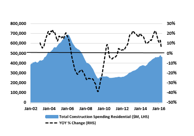
Figure 10. Total Construction Spending Still Well Below 2005-2006 Levels
Source: Fred.StLouisFed.org
Slight Positive – Total US Construction Spending Fell Meaningfully and Has Only Recovered Halfway. Looking at Total US Construction Spending above, we see that monthly spending fell from a peak of $700 billion per month in early 2006 to roughly $250 billion per month by mid-2009, a 65% peakto-trough decline. Since that time, spending has recovered roughly halfway back, towards $500 billion per month. While clearly activity has picked up off the lows, we see that total Construction Spending has only rallied back to 2003-2004 levels, and with growth rates that have begun to rationalize in the past half year.
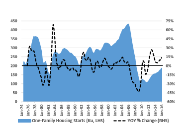
Figure 11. Total US Housing Starts (Single Family) Still Well Below 2005-2006 Levels
Source: Fred.StLouisFed.org
Positive – Housing Starts are now in their sixth year of growth, but have only rallied back to prior cycle troughs. Looking at Total US Residential Housing Starts above we see that starts have only now rallied back to all time modern lows achieved in the recessions of 1982 and 1991. This suggests that housing starts fell well below consumption levels, and likely stayed there for 2009-2014, and are now heading back towards housing consumption levels. We do see ramping housing supply as a risk at this point in the cycle, but supply additions seem manageable here.
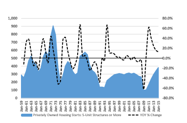
Figure 12. Total US Apartment Starts (Five Units or More) Have Rallied Back
Source: Fred.StLouisFed.org
Modest Negative – MFU Apartment Starts have Rallied Back to Levels Last Seen in the 1980s. Looking at Total US Apartment Starts (Five Units or more) above, we see that starts have rallied back above prior cycle peaks, increasing supply risks to this market, and up to levels last seen in the mid-1980s. Yes this is somewhat concerning as an apartment owner and investor, but we note that Single Family housing starts have fallen meaningfully, and that a demographic shift is taking place as more young people rent, and as more elderly people move into apartment-style assisted living facilities. This is a key metric for us to continue to observe, and we note encouragingly that year-over-year growth rates are moderating back down to normal levels after the impacts of the Great Recession and subsequent recovery.
Overall Net Conclusions – The US economy seems reasonably healthy based on some of these key metrics, but significant risks remain. There are pluses and minuses in the economy, as usual. Some pluses: Employment data is strong and some jobs are available in the workplace as evidenced by a rising number of openings and quits. We think the commercial banking sector is much healthier than a decade ago, and that construction spending metrics, housing start metrics, home equity metrics, and others are more or less rational and appropriate. The minuses and risks we see relate to Government Debt (we will spend time here soon), the Fed’s newfound balance sheet assets and the resulting impact of $4 Trillion of new Fed liquidity, and we do think the low- and middle-class are hurting as wage growth rises more slowly than the prices of goods & services. One last, major risk is that it has been eight years since the last downturn, and downturns do cyclically occur (though businesses are getting better at managing through them). So, while we see some risks with the Fed and Government Debt levels, other key corporate and private sector data seems pretty healthy at this time, especially in the realty and banking sectors, flashing us green lights still for now. We will continue to monitor additional metrics in coming months ahead.




Leave A Comment